Preventing Color Contrast Errors with Effective Simulation Testing

Julia Undeutsch
Have you ever tried to read text on a screen but found it difficult due to color choices, making it hard to read? Or have you had trouble recognizing content on a screen in very bright or dimly lit environments?
An estimated 300 million people have color blindness, and about 253 million people have visual impairments, confronting these situations daily. Often, these situations stem from poor design decisions and could be avoided from the outset.
Designing for various visual impairments can be a challenge for designers and developers, especially when they don't fully understand how people with different visual impairments perceive web content.
Google Chrome provides a simple way for designers, developers, and anyone looking to expand their knowledge of text and color perceptions to display their designs and existing websites in different color vision deficiencies.
Through implemented emulation, it is possible to create an effect that helps see through the eyes of others, better understanding how products are perceived and visually understood by users. Continuously checking these results of web pages during development will prevent unwanted behavior in the future, making products as accessible as possible for visually impaired users from the start.
Color Contrast: What it is and what it means in the development of products
Color contrast is the ratio of contrast between two or more components. To be accessible, there must be adequate contrast between the color of the foreground information and the color of the background.
 Source: WebAIM Million Report. Last Update: March 28, 2024
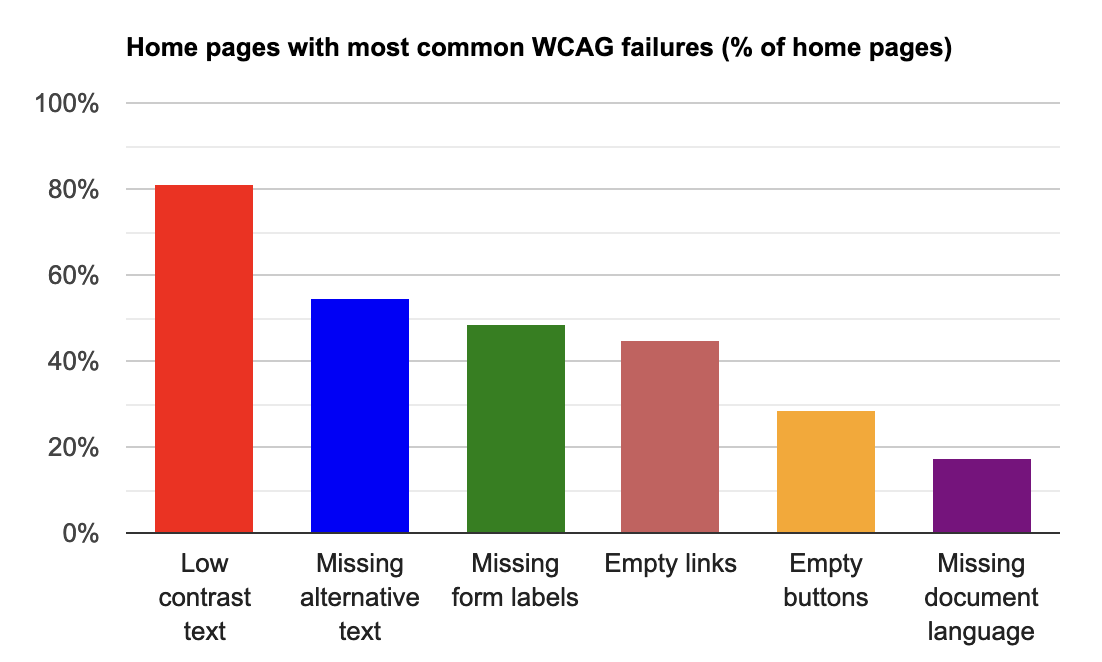
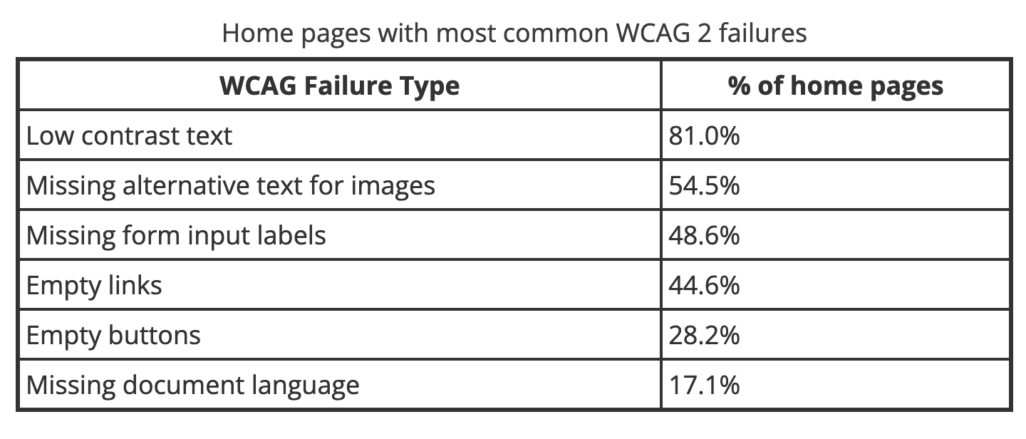
As the annual WebAIM study shows, insufficient color contrast is the most common automatically identified accessibility error on the web. More than 80% of all tested homepages have insufficient color contrast.
Contrast and color are crucial factors regarding accessibility. The content of a webpage must be perceivable for all users, regardless of visual impairment.
 Source: WebAIM Million Report. Last Update: March 28, 2024
Here are the results in tabular form. Homepages with the most WCAG 2 errors, categorized by WCAG error type and the percentage of homepages affected by them: Insufficient color contrast 81%, missing alternative text for images 54.5%, missing form input labels 48.6%, empty links/no link text available 44.6%, empty buttons/no button text available 28.2%, missing document language/homepage language: 17.1%.
To have a consistent understanding of good color contrast worldwide, the WAI Working Group has developed a color contrast formula that defines this value. For text on background, this value is 4.5:1, and for icons and graphics, it's 3:1 to their background. This can be measured using a color contrast checker, such as the WebAIM Color Contrast Checker. If this value is adhered to, people with moderate visual impairments can recognize and read text and graphics without needing assistive technologies.
Different Types of Color Vision Deficiencies
According to the World Health Organization (WHO), nearly 300 billion people have some form of color vision deficiency. Often referred to generally as color blindness, there are different forms of color vision deficiencies. These are explained in more detail in the next section. In the rarest cases, people cannot perceive color at all. In most cases, people with color vision deficiencies are unable to perceive red, green, or blue fully.
The causes vary. Some are genetically determined, while others result from a disease such as diabetes or multiple sclerosis. Aging can also be a contributing factor to color vision deficiencies.
These visual impairments often make it difficult to distinguish colors from each other, exacerbating color contrast problems.
Trichromacy (Normal Vision)
In normal color vision, all three types of cone cells are used, functioning properly. Another term for normal color vision is trichromacy. People with normal color vision are called trichromats.
Visual Acuity (Blurry Vision)
Visual acuity is measured according to an agreed-upon standard under the best conditions. The measurement is called visual acuity. The visual field is the area a person can see when their eyes are fixed in one position. This may appear blurry depending on acuity, making it unreadable due to small font sizes or little contrast.
Contrast Sensitivity
Contrast is the visual effect caused by the difference in brightness between adjacent foreground and background areas of an object. If one of the areas (foreground or background) is light and the other is dark, there is high contrast. With similar brightness values, such as beige on white or black on dark brown, the contrast is low. The higher the contrast ratio, the easier it is to visually discern the boundary between adjacent components.
Protanopia (Red-Blindness)
People with protanopia have reduced sensitivity to red light and tend to not differentiate black from various shades of red, or dark brown from dark green, dark orange, dark red, dark blue/violet, and black, among others.
Deuteranopia (Green-Blindness)
People with deuteranopia have reduced sensitivity to green light. They typically confuse medium shades of red with medium shades of green, turquoise with gray and medium pink, or light green with yellow, pale pink with light gray/white.
Tritanomaly (Blue-Blindness)
Tritanomaly is very rare, estimated to affect 1 in 30-50,000 people. People with reduced blue sensitivity have difficulty distinguishing between blue and yellow, purple and red, as well as blue and green. For these individuals, the world appears mostly as red, pink, black, white, gray, and turquoise.
Achromatopsia (Color-Blindness)
Achromatopsia or monochromatism refers to complete color blindness. This occurs very, very rarely, in about 1 in 33,000 people. People with achromatopsia or monochromatism can hardly perceive red, green, or blue light. Their world consists mainly of various shades of gray from black to white, similar to an old black-and-white television.
Simulation with Chrome DevTools
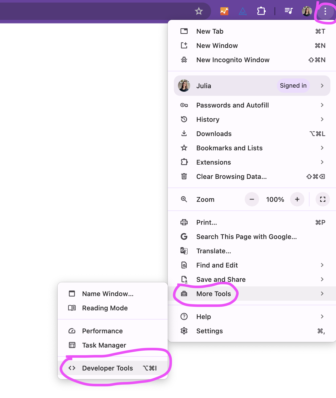
The best way to understand the different forms of color vision deficiencies is by comparing original images with simulated images of our website. Chrome DevTools offers designers and developers the ability to simulate the effects of these visual impairments on their own web applications, helping to identify and fix contrast issues, and above all, to understand them!
To simulate visual impairments:
Open DevTools
- Click on the three vertical dots in the top right corner of the toolbar
- Click on More Tools
- Click on Developer Tools
Open Rendering Options
- Click on the three vertical dots in the top right corner of the Developer Toolbar
- Click on More Tools
- Click on Rendering
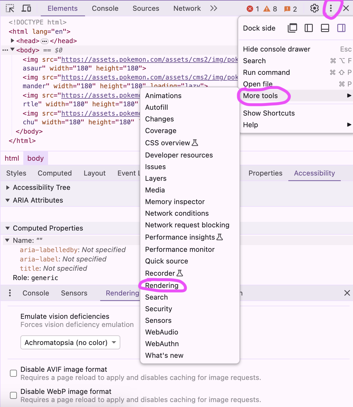
Now select one of the following options in the drop-down list under Emulate visual impairments:
- No Emulation
- Blurred Vision
- Reduced Contrast
- Protanopia (No Red)
- Deuteranopia (No Green)
- Tritanopia (No Blue)
- Achromatopsia (No Color)
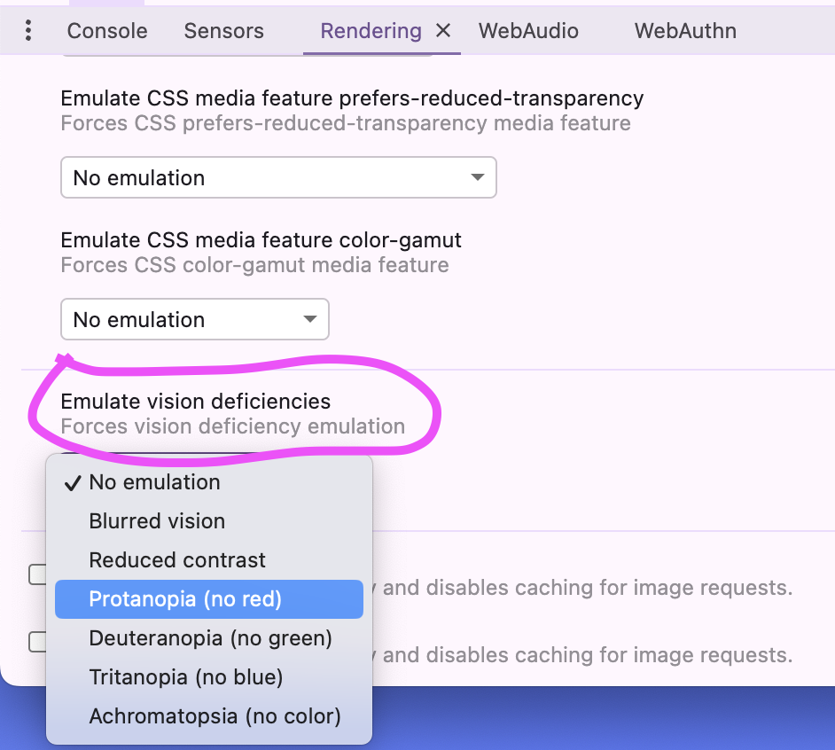
The webpage will now be simulated with the chosen visual impairment and will update with each new selection.
Results
In the 1990s, Nintendo released two Game Boy games that at first glance only differed in colour. We are talking about Pokémon Red Edition and Pokémon Blue Edition. The Pokémon games take their name from the colour of the Pokémon depicted on them. The red game features Charizard, the blue Blastoise, the green Venusaur (which was never released in Europe, by the way) and the yellow additional version Pikachu, which was released a year later.
This is also known as colour independence, as it is possible for anyone, regardless of whether they have colour vision deficiency or not, to distinguish the games from each other based on the Pokémon, even if the colours cannot be distinguished.
Let's take a look at how these bright colours of Pokémon affect people with certain forms of colour vision deficiency to better understand what we as designers and developers should consider before deciding on a colour and typography combination to avoid accessibility issues from the start.
Original image - Trichromacy
 A colourful image of the first generation starter Pokémon that does not simulate colour vision deficiency.
Blurred vision
 The effects of simulating blurred vision on the original image.
Reduced contrast
 The effects of simulating reduced contrast on the original image.
Protanopia (red blindness)
 The effects of simulating protanopia on the original image.
Deuteranopia (green blindness)
 The effects of simulating deuteranopia on the original image.
Tritanopia (blue blindness)
 The effects of simulating tritanopia on the original image.
Achromatopsia (colour blindness)
 The effects of simulating achromatopsia on the original image.
Conclusion
After presenting the original image in various forms of visual impairment using Chrome DevTools, the following can be concluded:
Colour blindness simulations show clear differences: by simulating colour vision deficiencies such as protanopia or achromatopsia, the challenges that affected individuals face when viewing coloured images become clear. Colours that are clearly distinguishable for people with normal vision can be difficult to distinguish for people with colour vision deficiency.
Contrast is crucial: The simulations show that sufficient contrast between the foreground and background is particularly important to ensure that information is easily recognisable for people with visual impairments.
Accessibility is important: the presentation of images should not only be designed for normal visual acuity, but also for a wide range of visual impairments. By considering accessibility guidelines and regularly testing images for their effect on different visual impairments, designers and developers can ensure that their content is accessible to the widest possible audience.
Overall, the visual impairment simulations in Chrome DevTools highlight the importance of accessible design for digital content to ensure that information is equally accessible to all users.
Resources
More about colour blindness https://www.colourblindawareness.org/colour-blindness
Understanding the minimum criterion of contrast https://www.w3.org/WAI/WCAG22/Understanding/contrast-minimum.html
Accessibility in contrast and colour https://www.w3.org/WAI/WCAG22/Understanding/contrast-minimum.html
World Health Organisation (WHO) Key facts about blindness and visual impairment https://www.who.int/en/news-room/fact-sheets/detail/blindness-and-visual-impairment
WebAIM Million Report 2024 https://webaim.org/projects/million/
W3 Colour contrast value definition https://www.w3.org/TR/WCAG21/#dfn-contrast-ratio
This post was originally published on Fronta11y for GAAD (Global Accessibility Awareness Day) 2024, in German.